Identity & Standards

Brand Guide

Official colors, logos, typography, and usage standards for Fredericksburg Technology.

Brand Identity

Color Palette

Our color system is built around three brand colors — purple, orange, and gold — paired with a clean neutral scale. Click any hex or RGB value to copy it to your clipboard.

Brand Purple
Primary brand color — the dominant expression of our identity across print, digital, signage, apparel, and physical applications.
Purple 950
#120831
rgb(18, 8, 49)
Purple 900
#1a0c3d
rgb(26, 12, 61)
Purple 800
#1e0f52
rgb(30, 15, 82)
Primary
Purple 700
#2c1577
rgb(44, 21, 119)
Purple 600
#3a1d9e
rgb(58, 29, 158)
Purple 500
#4a28c9
rgb(74, 40, 201)
Purple 400
#7356d9
rgb(115, 86, 217)
Purple 300
#9e87e4
rgb(158, 135, 228)
Purple 200
#c9baf0
rgb(201, 186, 240)
Purple 100
#ede8f9
rgb(237, 232, 249)
Brand Orange
Secondary brand color — used for emphasis, energy, and visual contrast across all brand materials and touchpoints.
Orange 900
#7c2710
rgb(124, 39, 16)
Orange 800
#a83417
rgb(168, 52, 23)
Orange 700
#d14d1c
rgb(209, 77, 28)
Primary
Orange 600
#f05a22
rgb(240, 90, 34)
Orange 500
#f47347
rgb(244, 115, 71)
Orange 400
#f78b66
rgb(247, 139, 102)
Orange 300
#faa489
rgb(250, 164, 137)
Orange 200
#fcbdac
rgb(252, 189, 172)
Orange 100
#fdeee9
rgb(253, 238, 233)
Gold Accent
Tertiary accent color — used sparingly when visual distinction from Brand Orange is needed. Orange remains the dominant accent in most brand applications.
Gold 700
#9a6b08
rgb(154, 107, 8)
Gold 600
#c98c0d
rgb(201, 140, 13)
Primary
Gold 500
#fcb017
rgb(252, 176, 23)
Gold 400
#fdc547
rgb(253, 197, 71)
Gold 300
#fed977
rgb(254, 217, 119)
Gold 200
#feecaa
rgb(254, 236, 170)
Gold 100
#fffae7
rgb(255, 250, 231)
Neutrals
Supporting palette used for body text, backgrounds, and structural elements across print and digital materials.
Gray 900
#111827
rgb(17, 24, 39)
Gray 700
#374151
rgb(55, 65, 81)
Gray 600
#4b5563
rgb(75, 85, 99)
Gray 500
#6b7280
rgb(107, 114, 128)
Gray 300
#d1d5db
rgb(209, 213, 219)
Gray 200
#e5e7eb
rgb(229, 231, 235)
Gray 100
#f3f4f6
rgb(243, 244, 246)
Gray 50
#f9fafb
rgb(249, 250, 251)
White
#ffffff
rgb(255, 255, 255)
Visual Identity

Logo Library

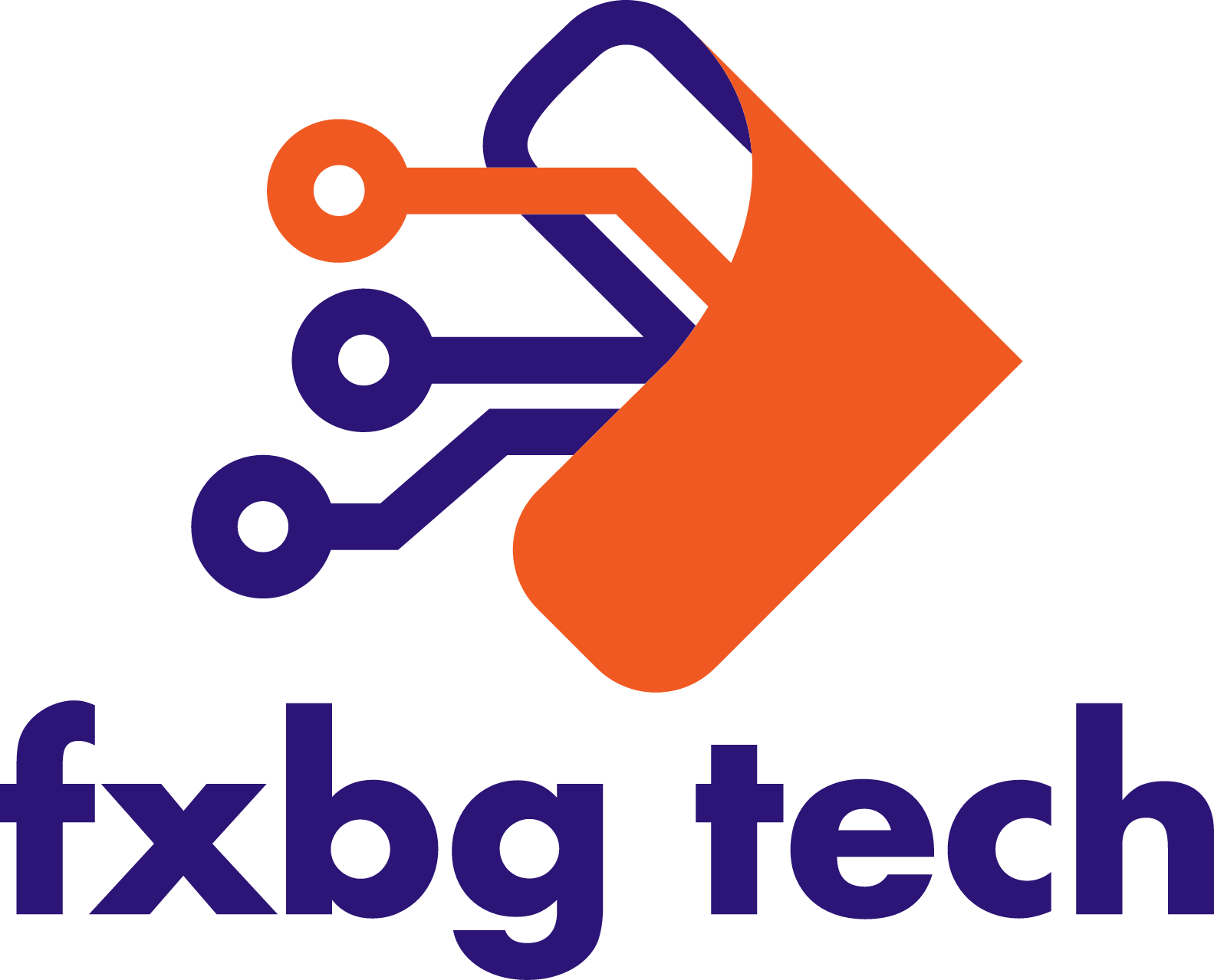
We have two primary logo layouts — Wordmark and Stacked — each available in multiple color variants for different background contexts.

Horizontal layout with the full company name — preferred for letterheads, presentations, signage, email signatures, apparel, and any context with adequate horizontal space.

Fredericksburg Technology — Wordmark — Full Color
Full Color
Light / white backgrounds

The primary logo. Use whenever full color reproduction is available — print, digital, signage, and beyond.

Fredericksburg Technology — Wordmark — Two Color
Two Color
Light / white backgrounds

Purple wordmark with orange accent — ideal for two-color print, spot color, and embossed applications.

Fredericksburg Technology — Wordmark — Single Color — White
Single Color — White
Dark / colored backgrounds

For dark, colored, or photographic backgrounds. Suitable for reversed printing, embroidery, screen printing, and engraving on dark materials.

Fredericksburg Technology — Wordmark — Single Color — Black
Single Color — Black
Light / white backgrounds

For light backgrounds — one-color print, grayscale documents, laser engraving, rubber stamping, and fax applications.

Fredericksburg Technology — Wordmark — Semi-transparent
Semi-transparent
Dark / textured backgrounds

White logo with a semi-transparent texture element on the accent mark — for watermarks, background overlays, and layered compositions.

Compact stacked layout — ideal for profile photos, social media avatars, badges, patches, embroidered apparel, square print formats, and any space-constrained or square application.

Fredericksburg Technology — Stacked / Square — Full Color
Full Color
Light / white backgrounds

Primary square mark. Use wherever the horizontal wordmark does not fit the format.

Fredericksburg Technology — Stacked / Square — Two Color
Two Color
Light / white backgrounds

Stacked mark with purple and orange accent — for two-color print and spot color formats.

Fredericksburg Technology — Stacked / Square — Single Color — White
Single Color — White
Dark / colored backgrounds

For dark or colored backgrounds — embroidery, screen printing, reversed print, and engraving on dark materials.

Fredericksburg Technology — Stacked / Square — Single Color — Black
Single Color — Black
Light / white backgrounds

For light backgrounds — one-color print, grayscale, laser engraving, and stamping applications.

Fredericksburg Technology — Stacked / Square — Semi-transparent
Semi-transparent
Dark / textured backgrounds

White stacked mark with semi-transparent texture element on the accent — for watermarks, overlays, and layered compositions.

Brand Typography

Typefaces

We use two typefaces across all brand touchpoints — Montserrat for headlines, titles, and display text, and Inter for body copy and supporting text in any medium.

Montserrat
Geometric sans-serif  ·  Available via Google Fonts & Adobe Fonts
Headlines & Display
SemiBold — 600
Fredericksburg
Bold — 700
Fredericksburg
ExtraBold — 800
Fredericksburg
Display ~52pt · ExtraBold
Simply Better Tech
Title ~40pt · Bold
Comprehensive Solutions
Section Heading ~26pt · Bold
Managed IT Services
Subheading ~18pt · Bold
Cybersecurity & Compliance
Label ~16pt · SemiBold
Structured Cabling Solutions
Section Label Uppercase · ExtraBold · Wide tracking
What We Do
Inter
Variable sans-serif  ·  Available via Google Fonts & Adobe Fonts
Body & Supporting Text
Regular — 400
The quick brown fox
Medium — 500
The quick brown fox
SemiBold — 600
The quick brown fox
Lead Copy ~17pt · Regular
We deliver responsive, honest, and genuinely excellent technology service to every organization we serve.
Body ~16pt · Regular
From managed IT and cybersecurity to structured cabling and commercial AV — all under one roof.
Supporting ~14pt · Regular
Our clients stay with us because we deliver on our promises and treat every organization with the attention it deserves.
Caption ~12pt · Regular
Founded 2022  ·  Fredericksburg, VA  ·  SWaM Certified
Font Availability

Both Montserrat and Inter are free, openly licensed typefaces available through Google Fonts and Adobe Fonts. They are suitable for print production, digital design, presentations, signage, apparel, and all other brand applications.

Standards

Usage Guidelines

These guidelines help maintain consistency and protect the integrity of our brand across all uses.

Company Name

The company name has three accepted written forms. Use the full name whenever context allows — abbreviated forms are appropriate in space-constrained or informal contexts, but must always follow the approved spelling and capitalization exactly.

Fredericksburg Technology
Full formal name. Use in official documents, proposals, contracts, legal contexts, and wherever space allows.
FXBG Technology
Preferred short form. Appropriate for signage, marketing materials, social media, and space-constrained layouts.
FXBG Tech
Informal short form. Acceptable in casual copy, social posts, merchandise, and conversational contexts.
Do
  • Use Fredericksburg Technology as the default in formal written contexts.
  • Use FXBG Technology or FXBG Tech as space-appropriate alternatives.
  • Match the capitalization exactly — “FXBG” is always all-caps; “Technology” and “Tech” are always title case.
  • Treat verbal references like “Fred Tech” as acceptable in speech — no action needed when customers say it conversationally.
  • When citing the website in any written material, use fxbgtech.com — lowercase, without the www. prefix. For subdomain references, retain the full address as needed.
Don’t
  • Do not write FredTech, Fred Tech, or Fredericksburg Tech in any published brand material.
  • Do not write FXBGTECH or any form without a space between “FXBG” and the word that follows.
  • Do not use lowercase, mixed case, or non-standard abbreviations (e.g. “fxbg tech”, “Fxbg Technology”).
  • Do not shorten the name further than “FXBG Tech” in written materials — single-word shortenings are not approved.

Logo Usage

Do
  • Use the full-color logo as the default whenever possible.
  • Use the white logo on dark, colored, or photographic backgrounds.
  • Maintain clear space equal to the height of the “F” in the logo on all sides.
  • Scale logos proportionally — preserve original aspect ratio at all times.
  • Use the stacked/square mark for circular profile photos, badges, embroidered patches, and small or square formats.
  • Download assets from this page or the official brand ZIP to ensure correct files are used.
Don’t
  • Do not stretch, skew, or distort the logo in any dimension.
  • Do not place the full-color logo on dark, busy, or low-contrast backgrounds.
  • Do not recreate, retype, or modify any element of the logo.
  • Do not apply drop shadows, gradients, or filters to the logo.
  • Do not place the logo at a size so small that it becomes illegible.
  • Do not use outdated or unofficial logo versions from outside this guide.

Color Usage

Do
  • Use Brand Purple (#2c1577) as the dominant primary color across all brand materials — print, digital, signage, and merchandise.
  • Use Brand Orange (#f05a22) for emphasis, action points, highlights, and visual accents.
  • Use Gold (#fcb017) sparingly as a tertiary accent — typically when visual distinction from Brand Orange is needed in a composition.
  • Use the tonal scales to create depth, hierarchy, and contrast in both print and digital layouts.
  • Ensure text always has sufficient contrast against its background — prioritize legibility in every application.
Don’t
  • Do not use off-brand colors not defined in this palette without approval.
  • Do not place white text directly on orange or gold — the contrast is insufficient for legibility.
  • Do not use multiple accent colors competing for visual attention in the same composition.
  • Do not use low-opacity tints as primary text colors — reserve for decorative and background use only.
  • Do not use gold as a primary or structural color — it is a tertiary accent, and orange should be the dominant accent in most cases.

Typography Usage

Do
  • Use Montserrat for all headlines, titles, subheadings, display text, labels, and callout copy across print and digital materials.
  • Use Inter for all body copy, descriptions, captions, and supporting text in any medium.
  • Use the section label treatment (uppercase, ExtraBold, orange, wide letter-spacing) to introduce content groups and sections.
  • Give text room to breathe — use generous line spacing for body copy and tighter spacing for large display text.
Don’t
  • Do not use any typeface other than Montserrat and Inter in brand materials.
  • Do not use all-caps for body copy or long-form text — uppercase is reserved for labels and section markers.
  • Do not use Montserrat at Regular weight — the minimum weight for headlines and titles is SemiBold.
  • Do not set body text at a size too small to read comfortably — legibility must be preserved regardless of medium.
Copied!